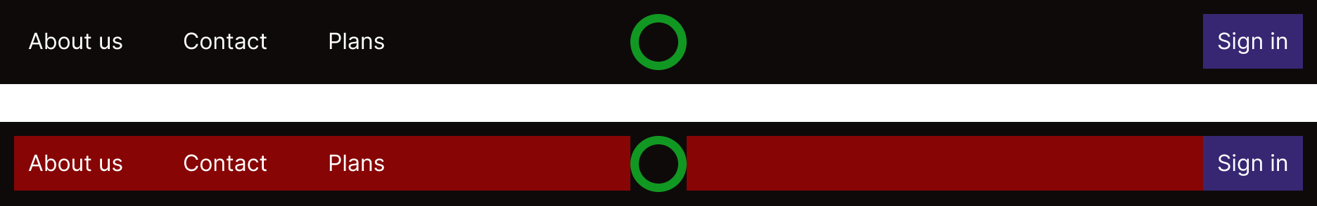
Hi @Muhammet_Fatih_Ozata,
you should make your parent frame an auto-layout, then :
- the frame with links (About us, contact and plans) should has a width of fill
- you can make the button Sign in into a frame that also has a width of fill
This will make the avocado center into the parent frame by having the links and button frame took all the space available (as show below)
(red box shows the auto-layout with
width set to fill, also don’t forget to left align the frame with links and to right-align the one with sign in button)
Hope it helped
Thanks for your answer.
However when I tried your solution I have a another problem:
my parent frame is auto-layout for sure .
I’m not sure what exactly is your problem but from what i can see :
- The Sign in button seems longer that before, you may set it’s width to hug
- you have a grid displayed, is it needed for something particular?
- By selecting a Frame, on the right panel you may change its children alignment so they all seems to be align (vertically, on the left/right, …)
Is there something else?
can ı ask a another question please ?
I need code of my project.I use figma to HTML plugin but when I open in html file here is the result :
everything mixing how can I solve it .Shortly I need the code part of how I see it in figma project.
I don’t use this plugin and thus cannot help you. I invite you to reach out to the team responsible for this plugin and/or create a new post clearly stating your need for help with the plugin on this forum.