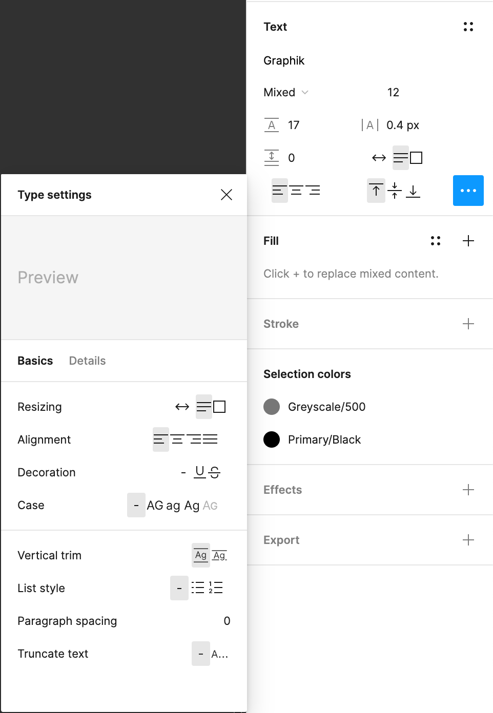
Anyone has this buggy UI after the release? Seems like most of the little buttons of the text panel don’t have horizontal padding and they’re quite small. Weird…


o_o that is… definitely compacted. I was looking at my desktop app, and it looks normal in both dark and light mode.


Is it possible you have any accessibility features that would enhance visibility? Also, shot in the dark: can you try help > troubleshooting > clear cache and restart to see if that corrects this?


There is also another UI bug happening: [bug] Bug in alignment


Reply